Cube Software

B2B FP&A Software Company

Refresh of a fintech brand to something fun, fresh, modern, in an industry that often feels antiquated and stuck in the past.

Year
2023

Work Done
Brand Refresh | Website Redesign
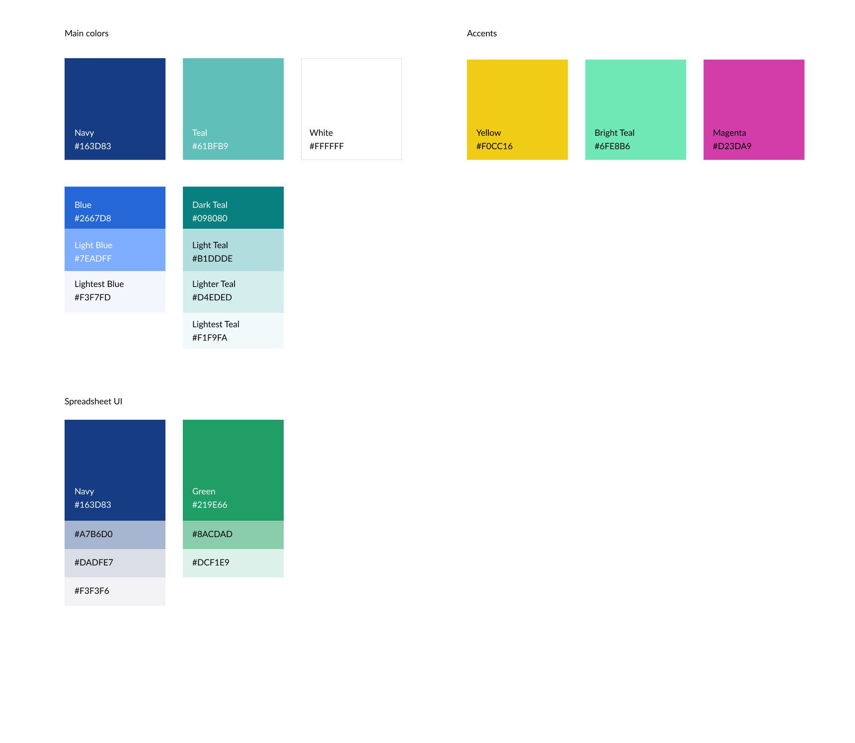
Brand Refresh

LOGOS

Modernize coloration on logo design and focus on use of negative space to articulate Cube value proposition in dimensional database spaces.

  • Cube represent multi-dimensional spaces (like a data Cube)

  • Focus on keeping coloration familiar to Microsoft Suite intentional nod to familiarity of “tools people know”

BRAND COLORS

We’re leaning into a family of blues and teals for the majority of our assets. Fresh and inviting, our full palette lends itself to moments of delight and surprise with pops of yellow, bright teal, and magenta to complement and emphasize key areas.


Our spreadsheet and platform UI illustrations lean into the iconic Microsoft and Google palettes audiences are familiar with.

TEXTURES

Our cube texture serves as a versatile design element we use to enhance our brand’s visual identity. Whether used as a subtle background, nestled into the corners of a design, or playfully scattered throughout, these cubes offer good visual interest and can be adapted into various color schemes using our brand colors.

GRAPHIC ELEMENTS

Cube uses graphic elements sparingly to focus attention and emphasize key content. Whether it’s underlining important words or employing accent lines to direct the viewer’s eye, these elements should enhance, not overpower, the overall design.

TYPOGRAPHY

We’re using three fonts to tell our stories: Montserrat, Lato, and Kalam.


Monserrat is our bold and impactful typeface, used for headlines. Lato is our trusty, versatile typeface, used for body copy. Kalam is our friendly typeface that brings personality, used for short callouts and highlights.

Brand in Use

Website Refresh